So Energy
Brand Strategy + Design
With renewables at its core So Energy is a UK energy supplier that offers green energy plans to households, helping customers reduce their environmental impact while providing award-winning customer service.
To bring the brand to life, I developed the brand strategy, architecture, and visual design of a dynamic new identity with a transparent, caring and honest approach to the tone of voice and visual communications.


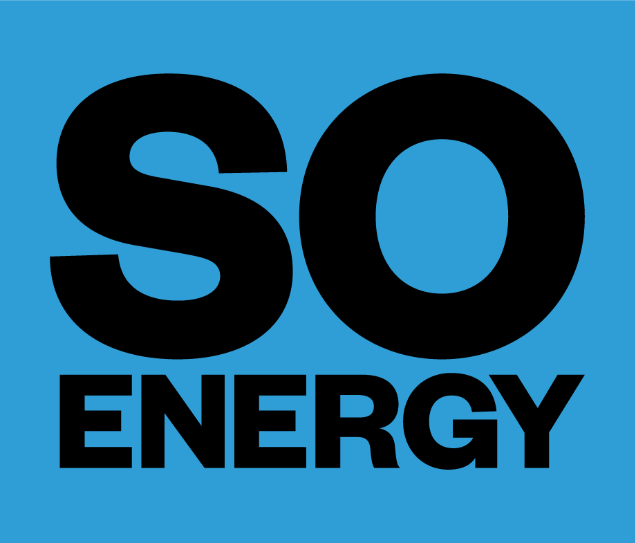


The logo acted as a stamp of approval for the brand, promoting positive change and empowering individuals to choose sustainable energy. Its large, bold design aims to stand out in a highly competitive market and encourage people to take action.


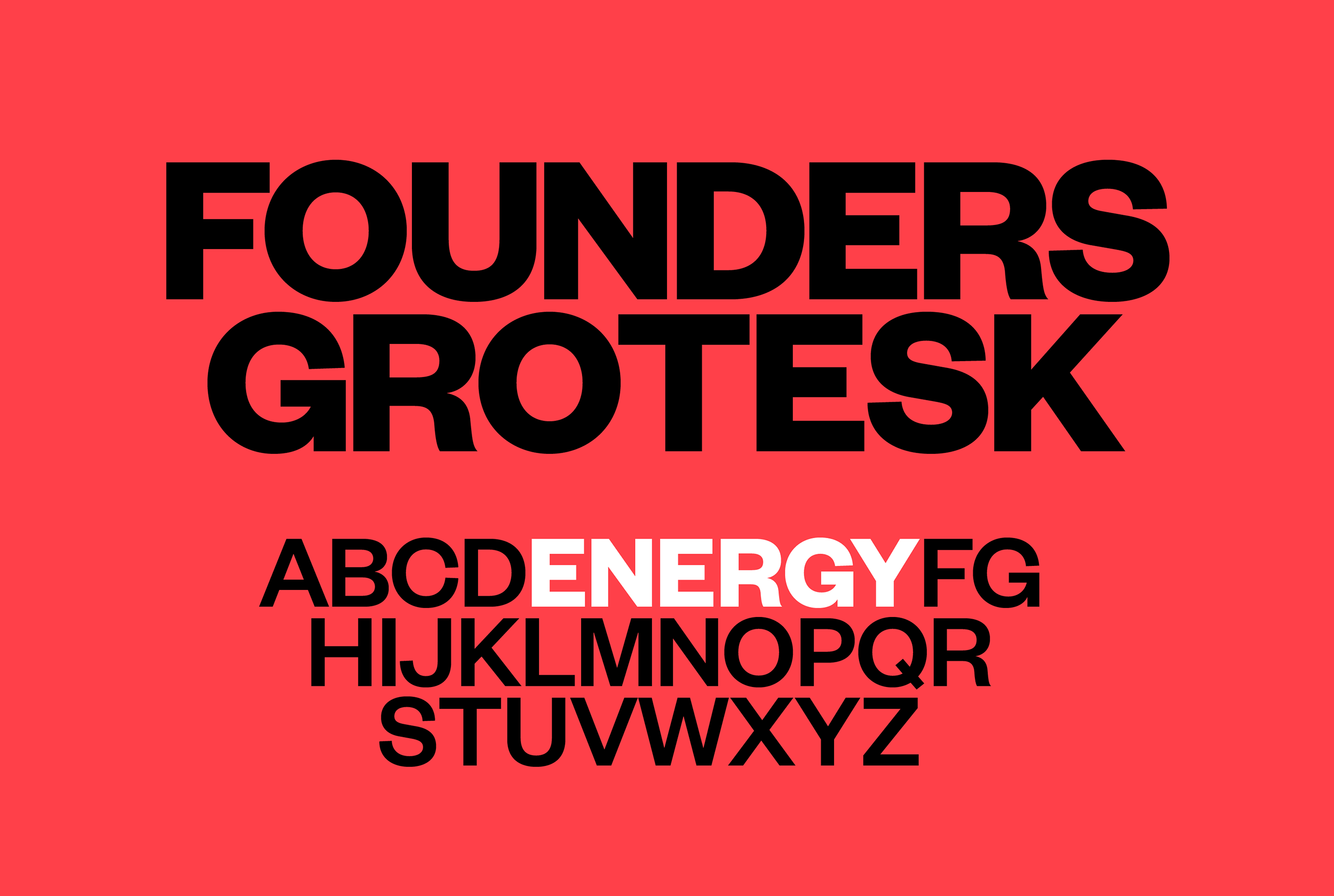
Founders Grotesk was selected as the brand typeface due to its clean and neutral appearance. It possesses a strong personality that balances professionalism with a hint of irregularity, preventing it from feeling dull or sterile. The handcrafted elements in Founders, such as the subtle flaring and uneven cuts in the terminals, add an approachable quality and a slight sense of uniqueness to the design.
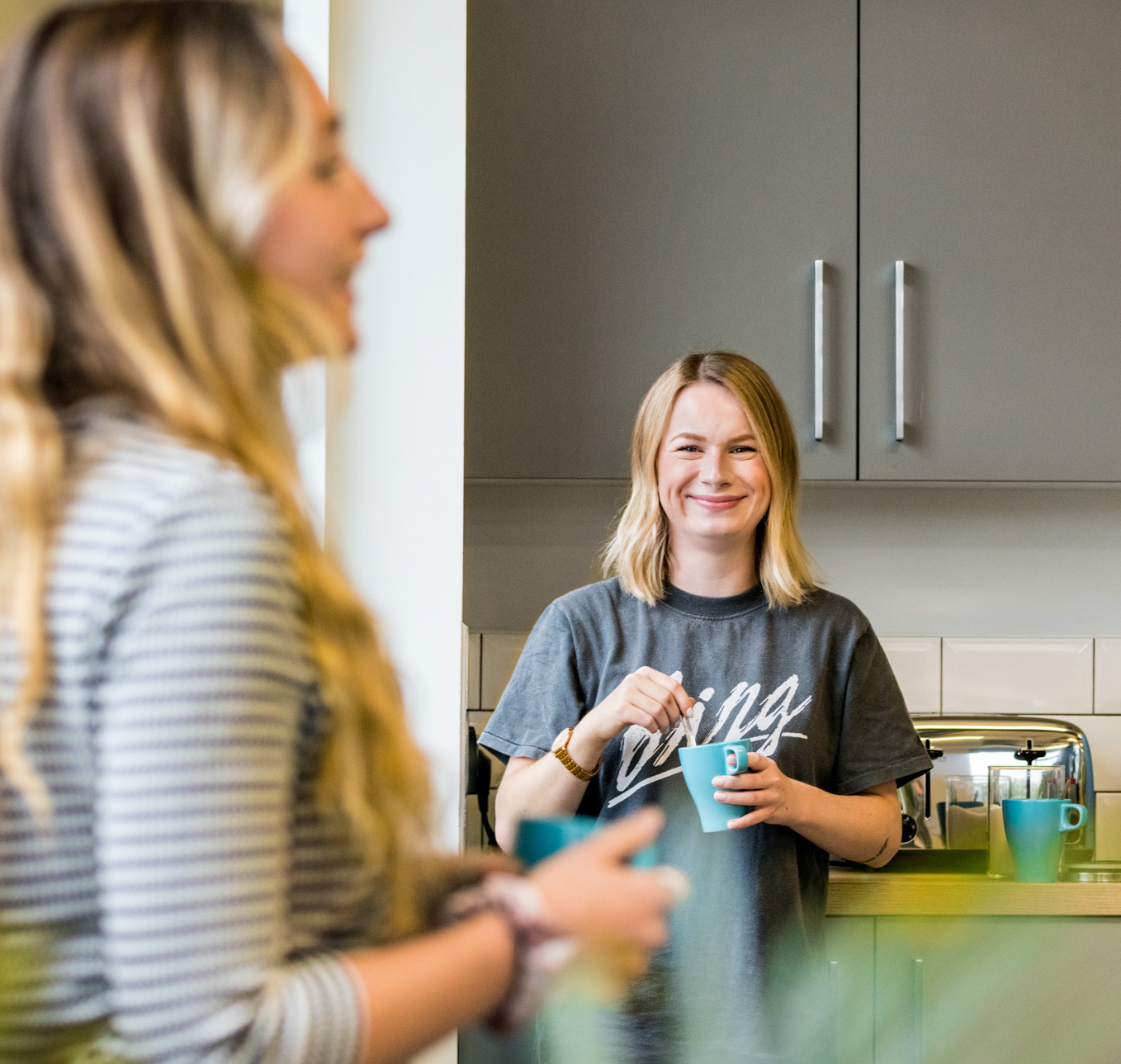
A carefully curated selection of images was made to communicate visually with customers to convey a clear and consistent brand message. All photography was intended to express activity, simplicity and making a positive change.


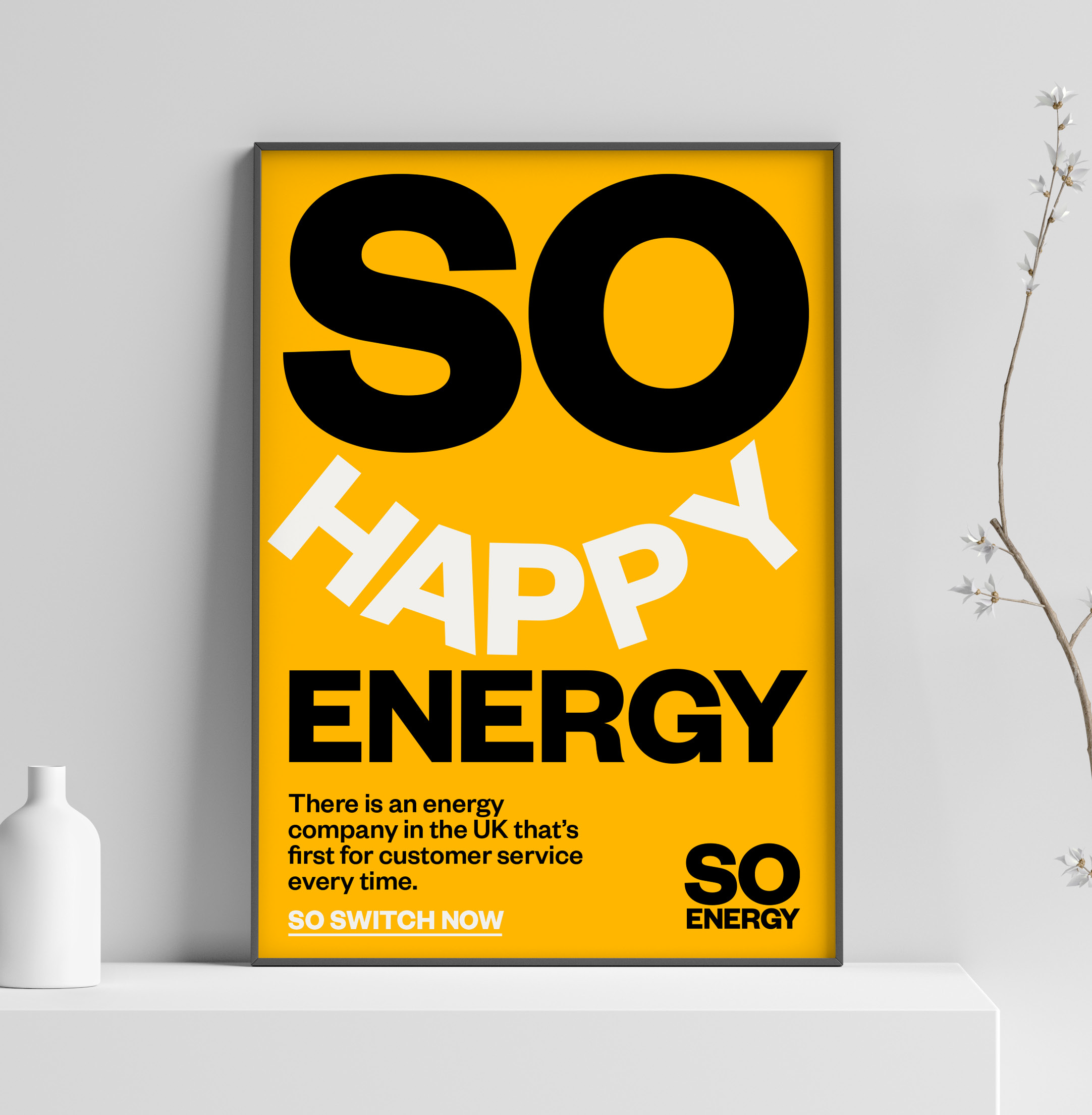


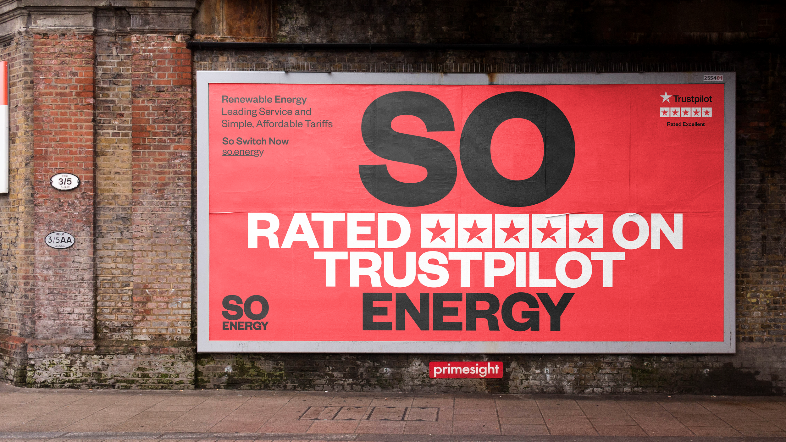
Consistent application of the So Energy branding across various media created a recognisable image for the company, fostering trust and delivering a unified message. This consistency enhanced brand awareness, customer loyalty, and positive perception, whether on websites, social media, print ads, or packaging.


“So Energy consistently provides excellent customer service, making them a standout in the energy market; their user-friendly app and proactive communication regarding tariff changes have been invaluable."
— Which? Magazine